The goal is to Communicate: An Interview with Eric Fischer
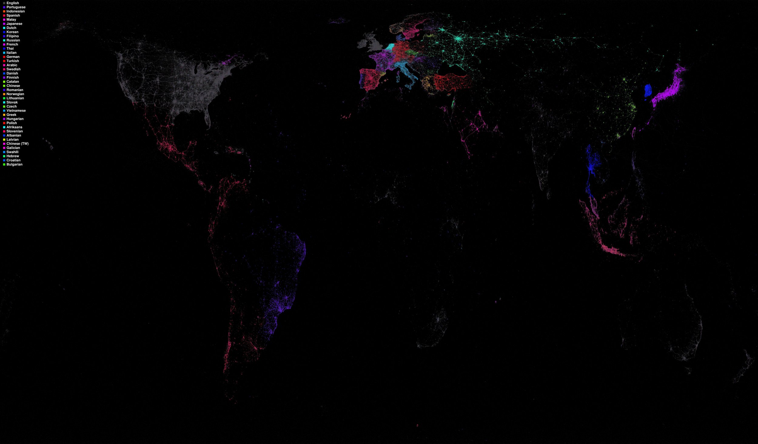
/Eric Fischer, "Language Communities of Twitter," 2011.
Praxis' mission is to provide a forum for writing center scholarship, and we believe that the best way to do that is to provide that scholarship through digital open-access publication. This is true for multiple reasons that have been discussed on this blog before, both practical and philosophical, and our upcoming launch of Praxis Research Exchange is meant to further the overall mission of the journal. By sharing not just our conclusions, but the data from which we draw them, scholars can work towards a more horizontal model of knowledge-sharing in the academy and increase the amount of dialogue around quantitative methods, methodologies, and specific data sets. Writing centers across the country and around the world can do this too, by sending PRX their data sets, as the writing center at the University of Texas at Austin already has. As part of this dialogue we at Axis sit down today (digitally) with Eric Fischer.
Eric Fischer is a visual artist and computer scientist based in San Francisco. He works with code to make art out of data he takes from public sources, and his images have been featured in MoMa's 2010 exhibition "Talk To Me" and in various publications including the Norwegian daily newspaper Dagbladet and American publications Esquire, Wired, and Popular Science. Eric is currently working on improving map accuracy and creating data visualization tools at a tech company with offices in San Francisco and Washington, D.C. Today Praxis Managing Editor Thomas Spitzer-Hanks interviews Eric on his work and his field.
1. I've read that you have some training in mathematics and linguistics, and that you've worked as a programmer, but I know you've also been featured in a Museum of Modern Art show. What's the common thread there?
My math background is not actually that strong. I initially registered as a math major in college because that was what you had to do if you really wanted to do computer science, but Complex Analysis, or at least the way it was being taught, was beyond my abilities, and I had to change directions. I switched to Linguistics because I had already completed a lot of the requirements through testing out of a couple years of French and having taken some other Linguistics classes for fun. There are actually a lot of characteristics that are analogous between human and computer languages, so the two fields are not as unrelated as they might seem. I never expected to be known as an artist and had no formal preparation for it. Whenever I had a choice I always took music classes instead of visual art.
2. Do you remember your early data visualization art fondly? How long have you been doing this, and how do you feel the process or the finished product has changed?
The earliest visualization images I made public were in 2010. I am very conscious of things I could have done better than I did, but I think for the most part they hold up pretty well, and I am continually surprised as new people discover things that I thought anyone who might possibly be interested would have seen ages ago. What has changed more recently is a focus on trying to make web maps that will work for any area, at any scale, rather than static images of specific areas.
3. What is your workflow/process? How do you generate the images?
I used to write a lot of custom code, and frequently made programs that wrote out PostScript files that I then rendered with Ghostscript. The data analysis still always requires custom programming, but more recently I've been trying to do as much of the rendering work as possible through two open-source tools that I wrote: Datamaps, which is a standalone tool to create web map tilesets, and Tippecanoe, which encodes vector data that can then be styled with Mapbox Studio and rendered on demand by the Mapbox tile serving infrastructure.
4. You've expressed some doubt about data's ability to last, especially in the case of a massive loss of power. Since your art is partly a visualization of the past, do you think it's fair to see it as elegiac or in some way a testimony to the passage of time? What is the emotional content of your art, for you?
I do worry about the persistence of our civilization's documents. File formats and online services are very fragile, and digital files will survive only if people actively preserve them, unlike so much on paper that has been preserved more or less by accident. I'm glad people at institutions like the Internet Archive are working so hard on this problem.
I've done a certain amount of trying to show the passage of time, such as by revisiting the locations of my grandparents' 30-year-old snapshots of San Francisco and duplicating the angles, but if anything, I think the data work that I do shows how persistent people's overall patterns are over time. We can't look all that far back yet in data, but at least at the scale of a decade or so, a map of top tourist photo locations in 2005 looks a lot like the map of top tourist photo locations in 2015.
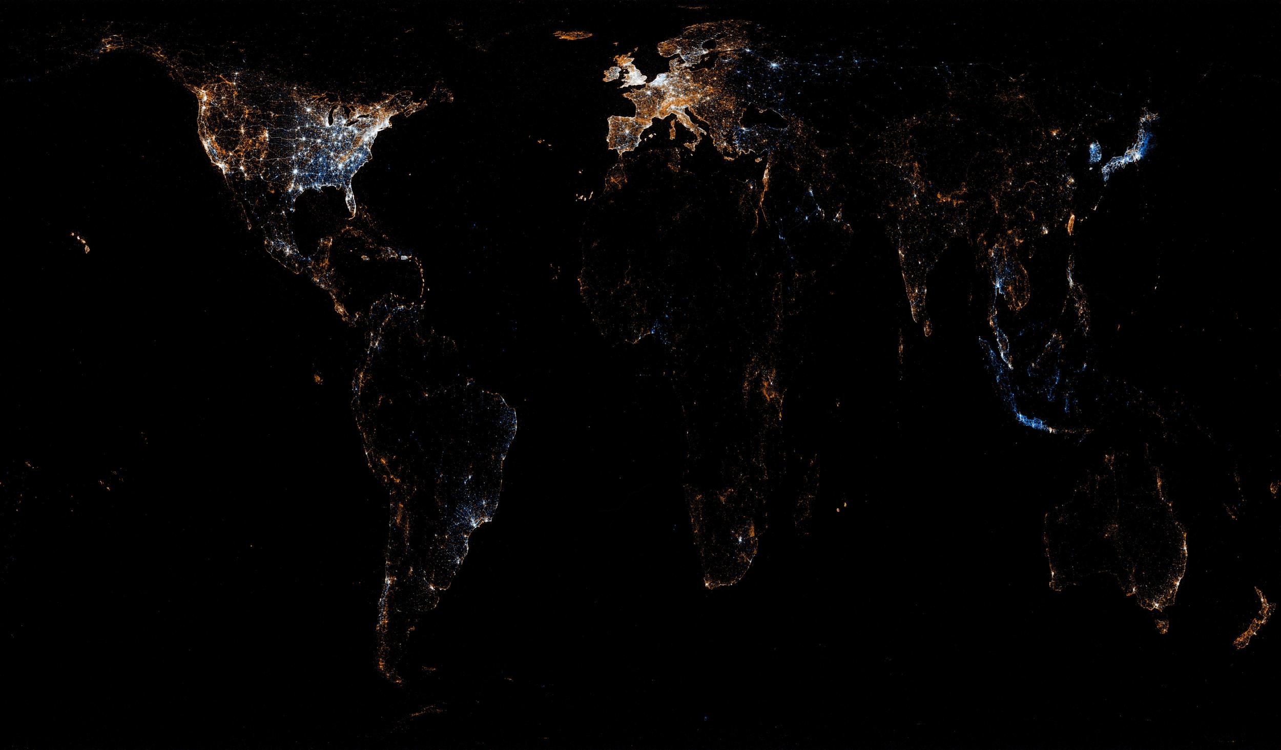
5. You work a lot with data having to do with travel and with communication, especially tweets, photographs uploaded to Flickr and Picasa, and transit data. All of it inhabits a space between ephemera and artifact and the use you make of tweets and photographs doesn't have a direct connection to their actual content. Is there something beyond the usability of this data that attracts you to it? Is the process important beyond being a path towards the finished image?
There is certainly some availability bias to it, but the thing that ties these all together is that they represent aspects of how people experience cities in space and time. I want to understand what the core difference is between places that feel alive and places that feel dead and empty, and whether places that are dead now could be alive in the future, and if so, what it would take to make it happen, and what else might suffer in the process.
6. What would you say is more important as you create a data visualization/artwork - the aesthetic impact or the technical accuracy of the work? Or is that even a question you ask yourself?
Telling the truth is definitely the priority. But that can be done most effectively by taking as much advantage as possible of our senses. The goal is to communicate, which means putting data into the form where it can be most readily perceived.
Praxis would like to thank Eric Fischer for participating in this interview, for making his images, and for granting us permission to display his art.


